BROWNIE/Project Gallery
Category:
Gallery & Cafe
Clients:
BROWNIE/Project
Location:
Block 6, M50 Creative Park
No.50 Moganshan Road
Putuo District, Shanghai
Gross Built Area (Square Meters):
290m²
Design Year:
2019.05 - 2019.08
Completion Year:
2019.08 - 2019.09
Photo Credits:
Hu Yanyun
Category:
Gallery & Cafe
Clients:
BROWNIE/Project
Location:
Block 6, M50 Creative Park
No.50 Moganshan Road
Putuo District, Shanghai
Gross Built Area (Square Meters):
290m²
Design Year:
2019.05 - 2019.08
Completion Year:
2019.08 - 2019.09
Photo Credits:
Hu Yanyun
“All the world’s a stage.” – William Shakespeare
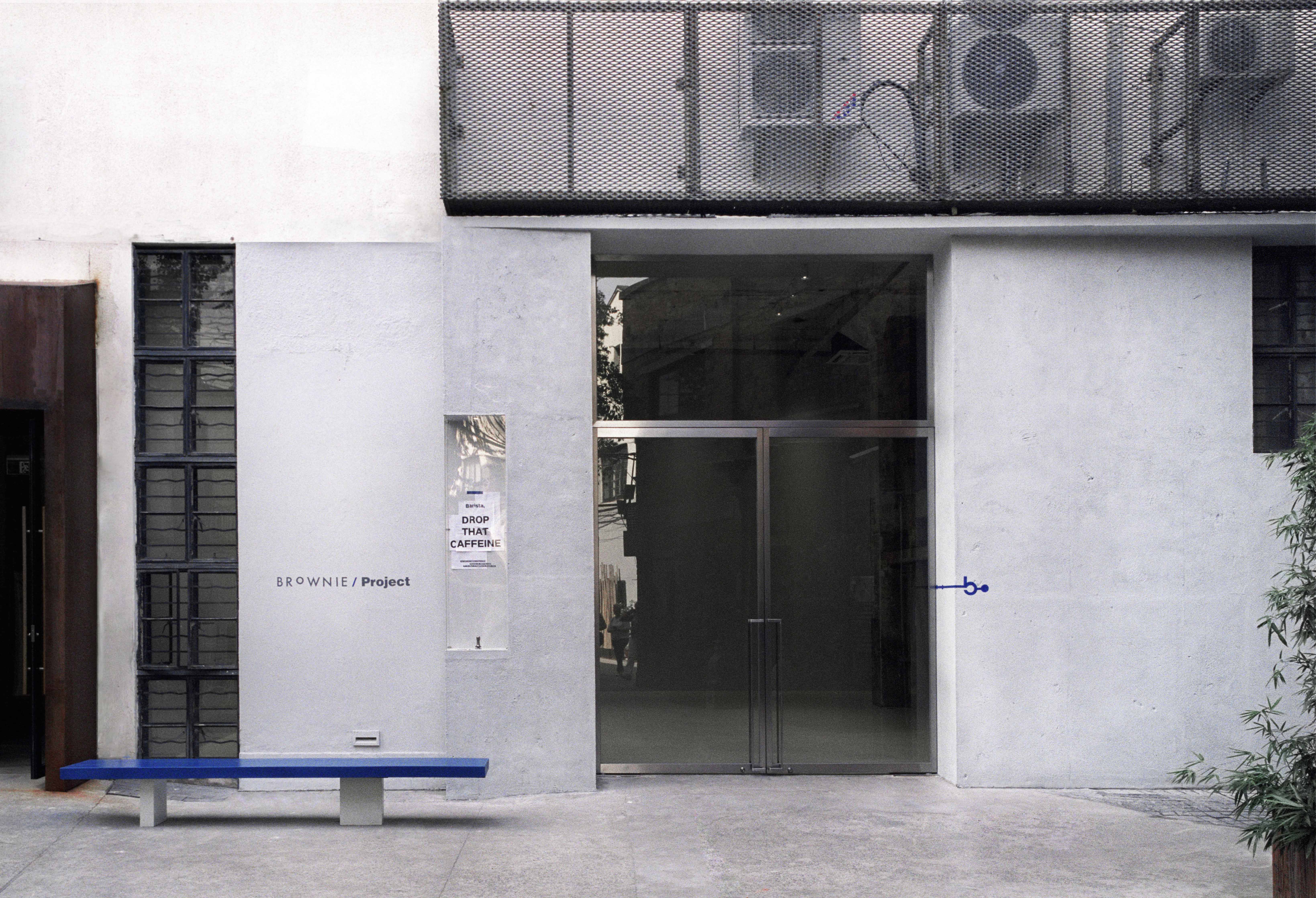
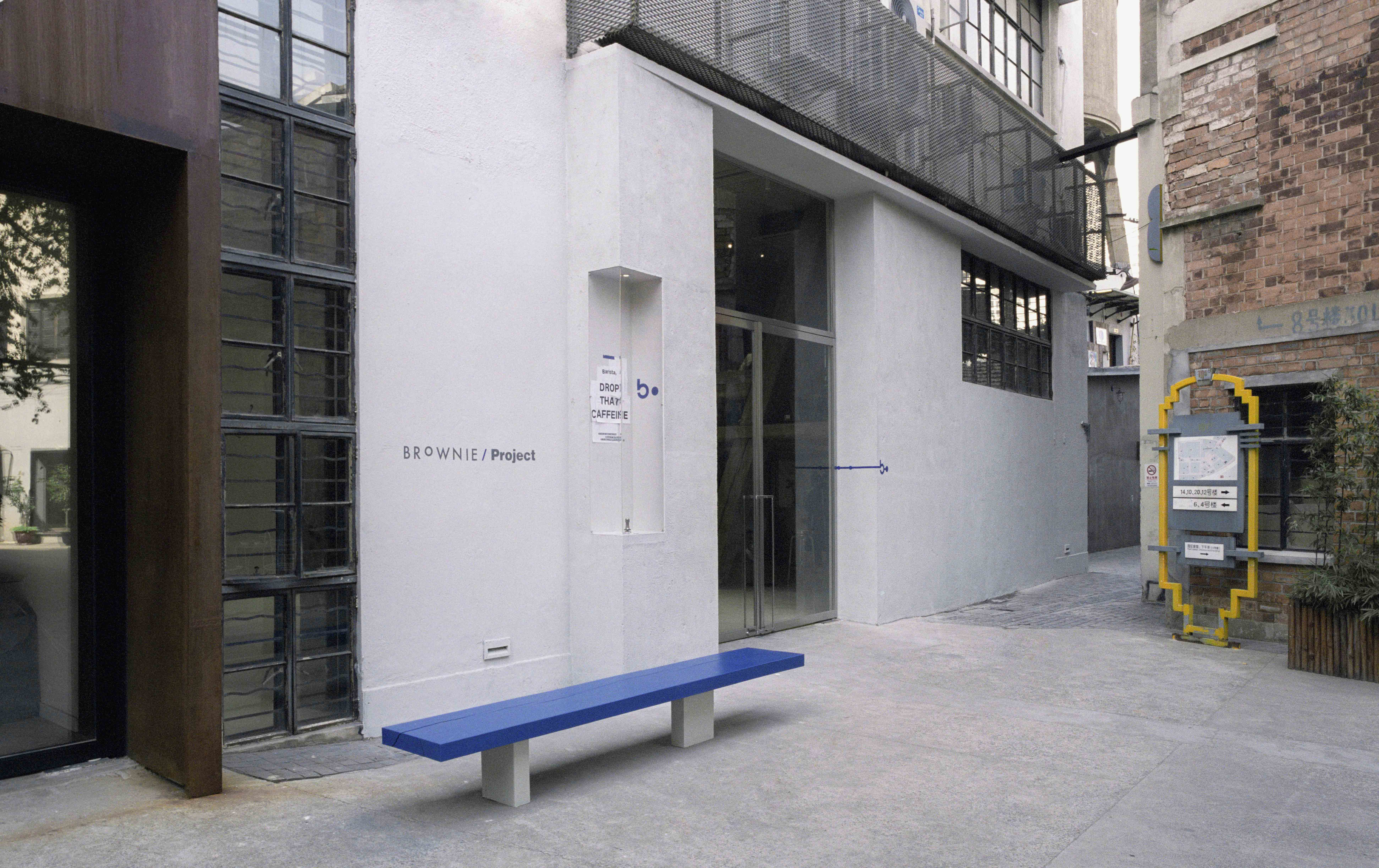
Situated at M50 Creative Park in Moganshan Road, BROWNIE/Project gallery blends the vibes of arts and commercial seamlessly. This creative park used to be an old woollen mill manufacturing plant, and the building it occupied was transformed from an old factory.
BROWNIE/Project is about photography, yet not limited to photography. It is birthed out of the heart to show everyone good photography works and cultures from around the world. A good photography work brings enlightenment, inspiration, perspectives and even cultures to its viewers. It also explores the interaction possibilities between space, people and life. Thus BROWNIE/Project is meant to be more than just an art gallery.
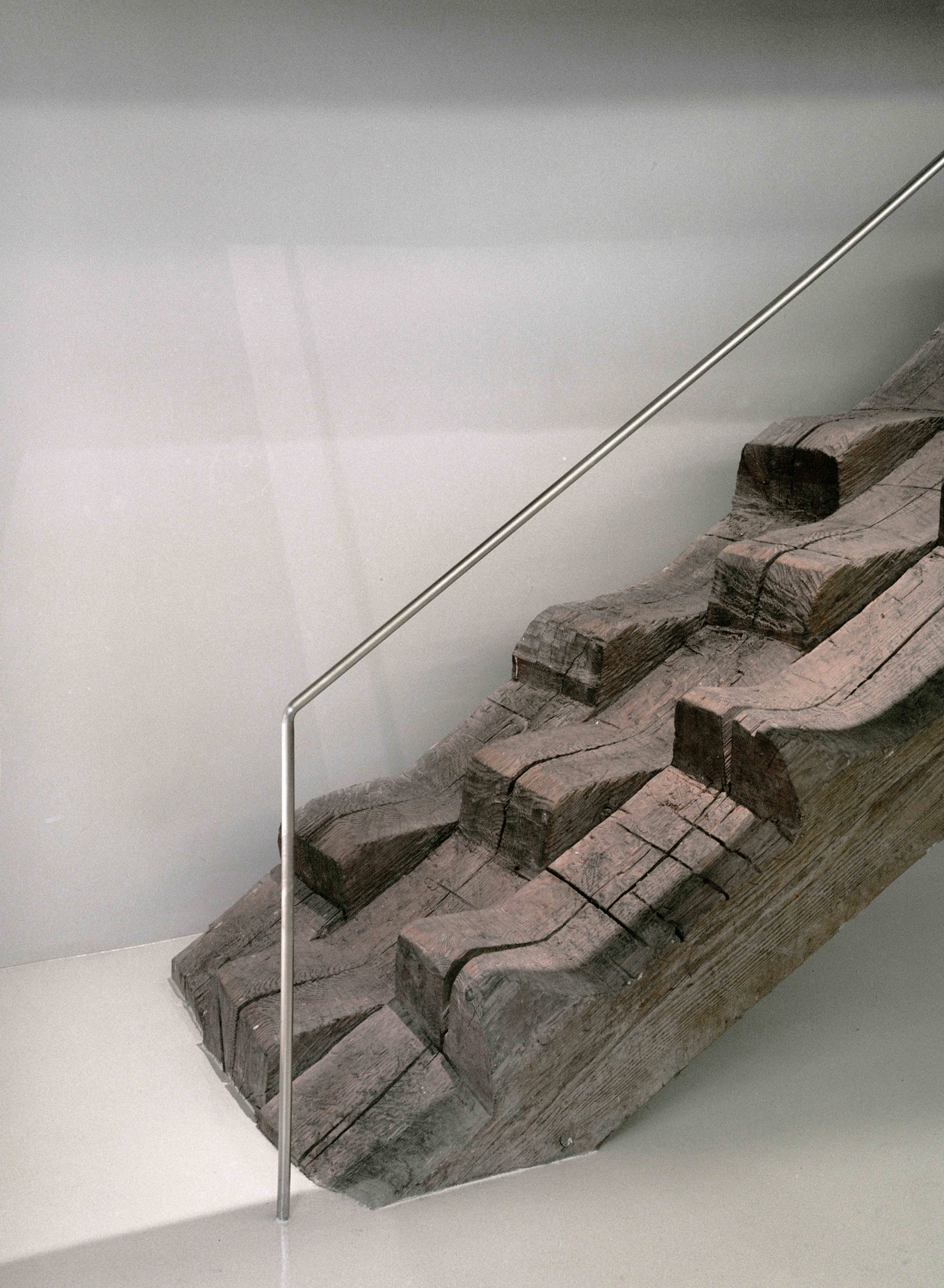
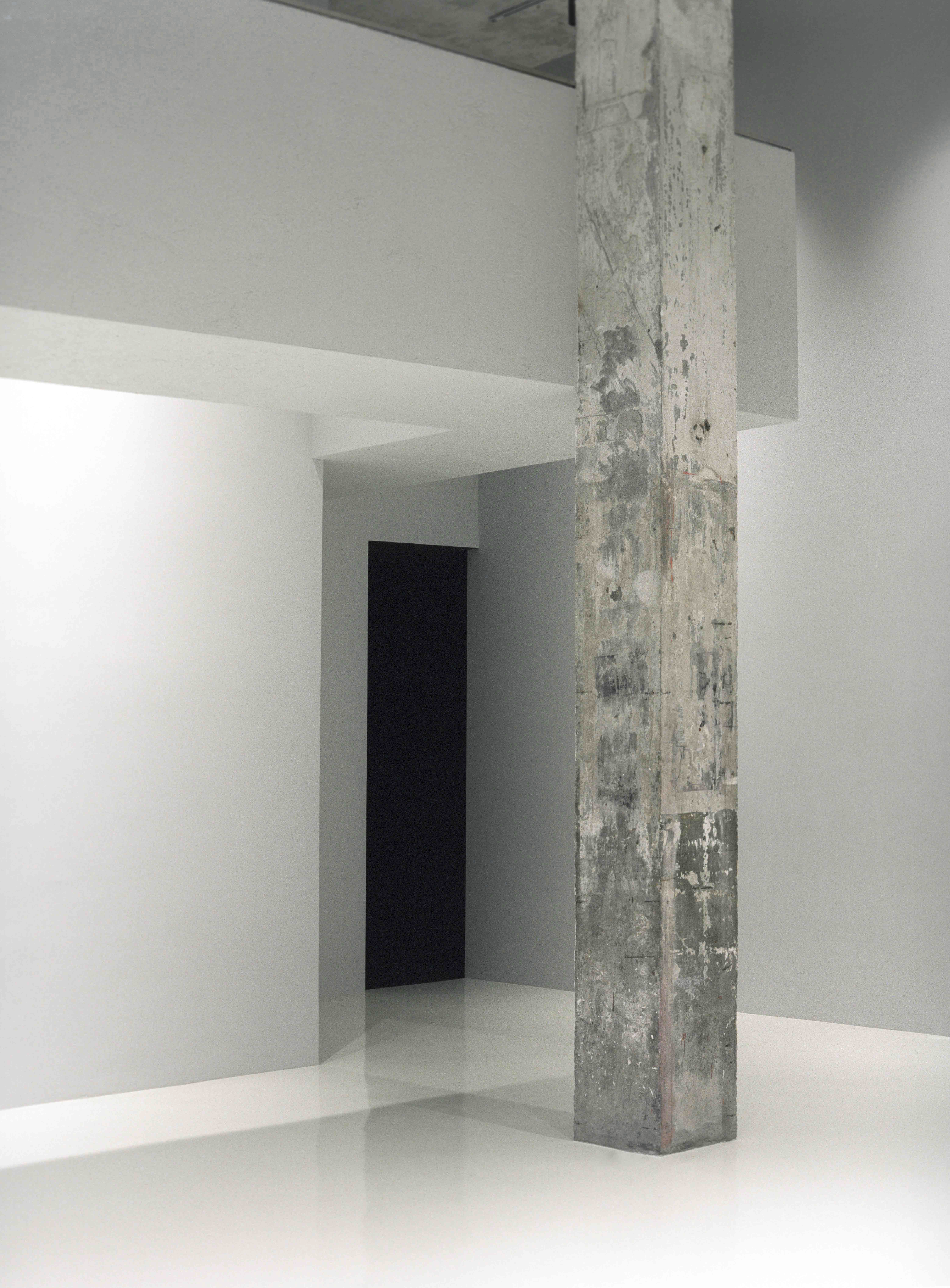
When we first visited BROWNIE/Project, we were mesmerised by its unique combination of industrial vibe from the concrete columns and steel window frames and artistic vibe from the wooden inverted A structure and staircase. After a chat with our client, we gathered that these vintage wooden structures were once part of an old Suzhou River bridge, which the previous tenant had paid a handsome sum to move here. Not only did these special traits provide a sense of coherence between the new inhabitants and the space, they also gave a clear and concrete direction and boundary for our new design. Our client conveyed that they wanted to keep intact the special traits of these structures while creating new functions for this space, which coincidentally is exactly the same idea we had in mind right after we visited the space.
The main requirement is to distinct areas between the gallery and café. On top of that is to design a new circulation, which makes the simple and dull space more vibrant and interesting, maximizing space utility. How to add in a vibrant and clear circulation in this distinctively unique space, how to make the space more inclusive, and how to make the new design language and the vintage building to complement each other are the three main challenges this time.
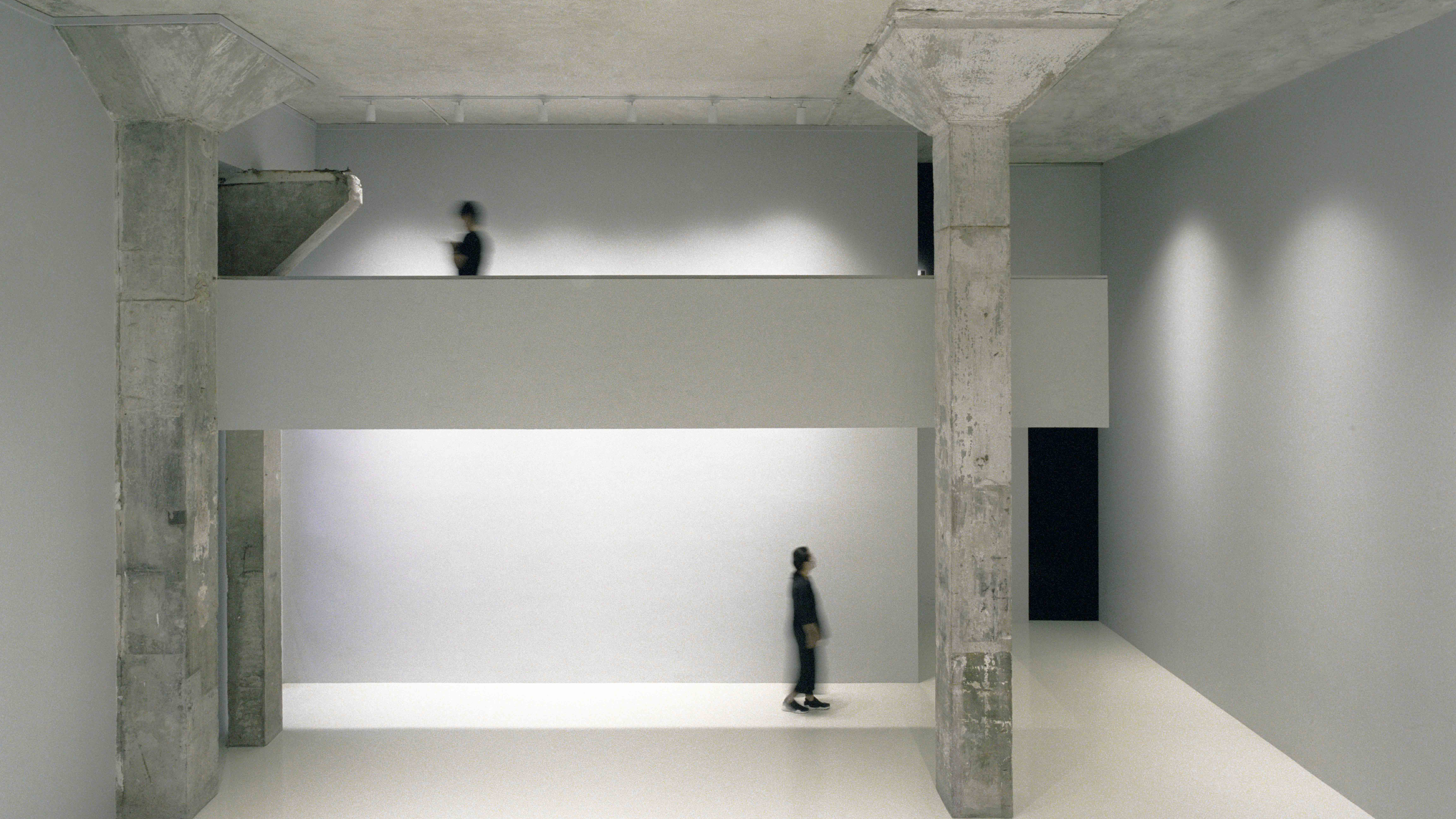
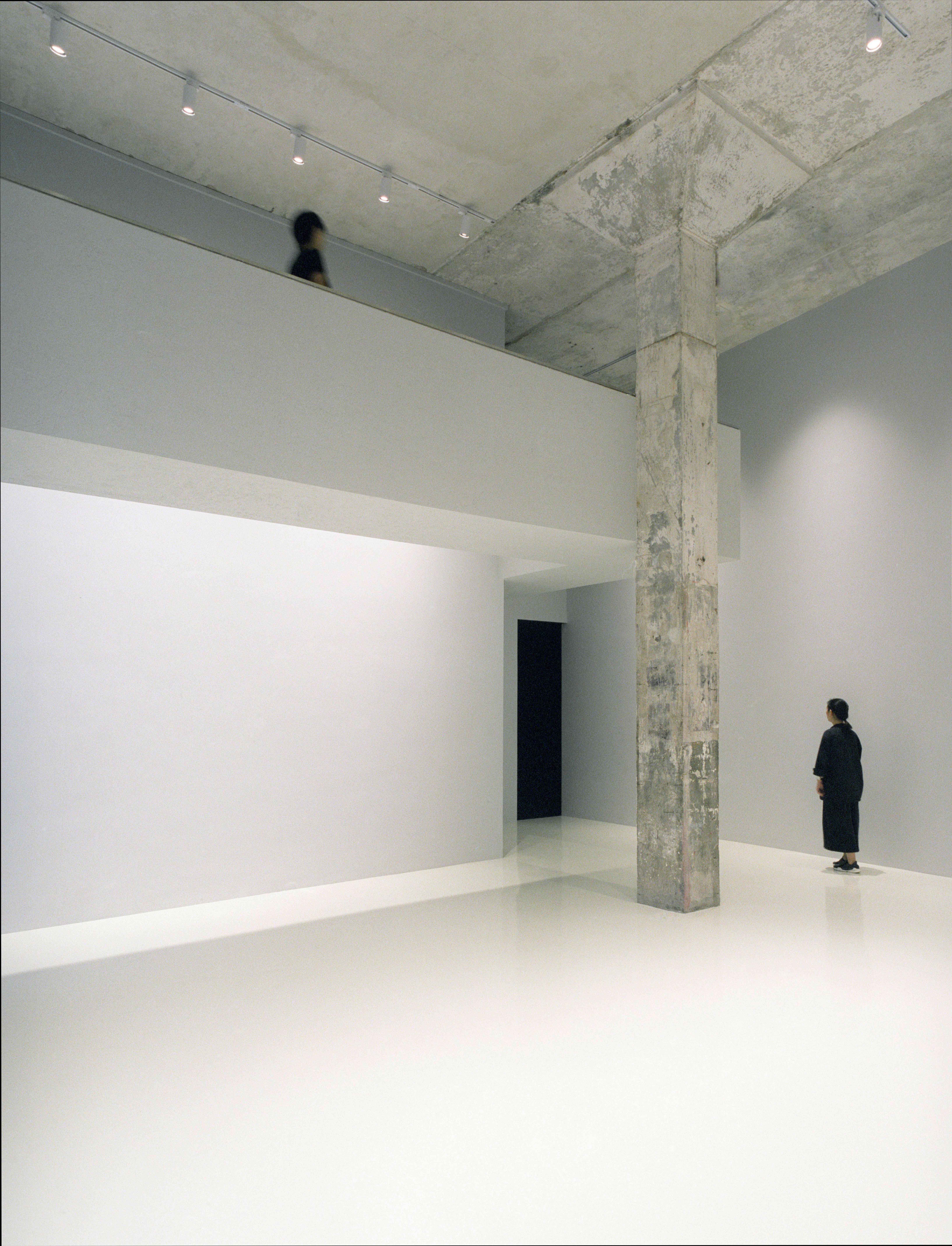
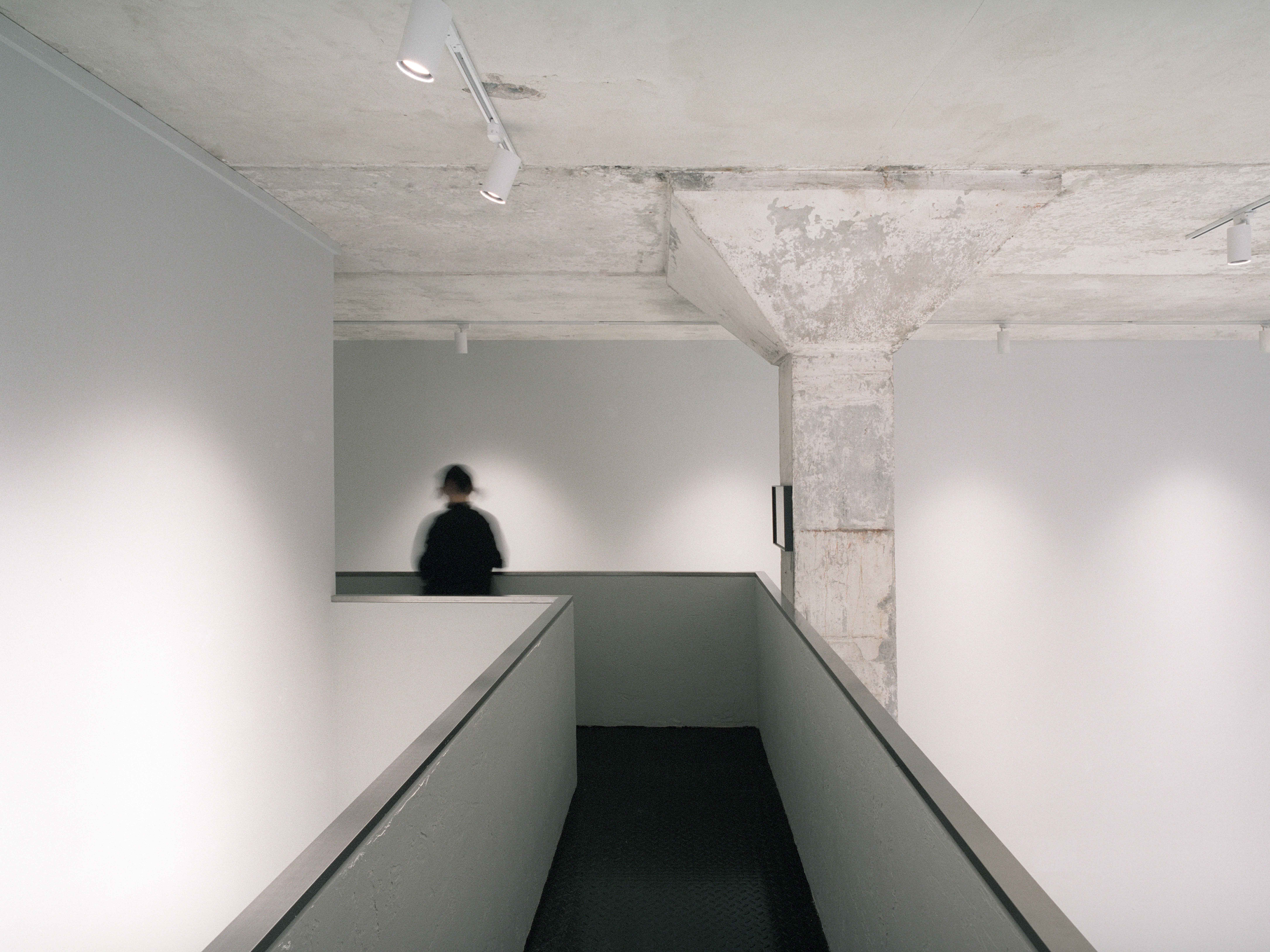
One of the advantages that a factory boasts is high-ceiling, and this is no exception for BROWNIE/Project. Since the beginning of our design process, we had been deliberating over how to create a vibrant and reasonable circulation in this 6m high space. The first attempt is to directly connect the mezzanine on the two sides, but this would destroy the entirety of the space and took away its strength. Thus we immediately changed our design direction, to ensure the emphasis of the totality of the centre space. With that as the basis of our design, we inserted a ‘floating bridge’ on one side of the gallery which sits across the café. This way, we enhanced the three-dimensional spatial richness and prevented it to steal the highlight of the high ceiling space.
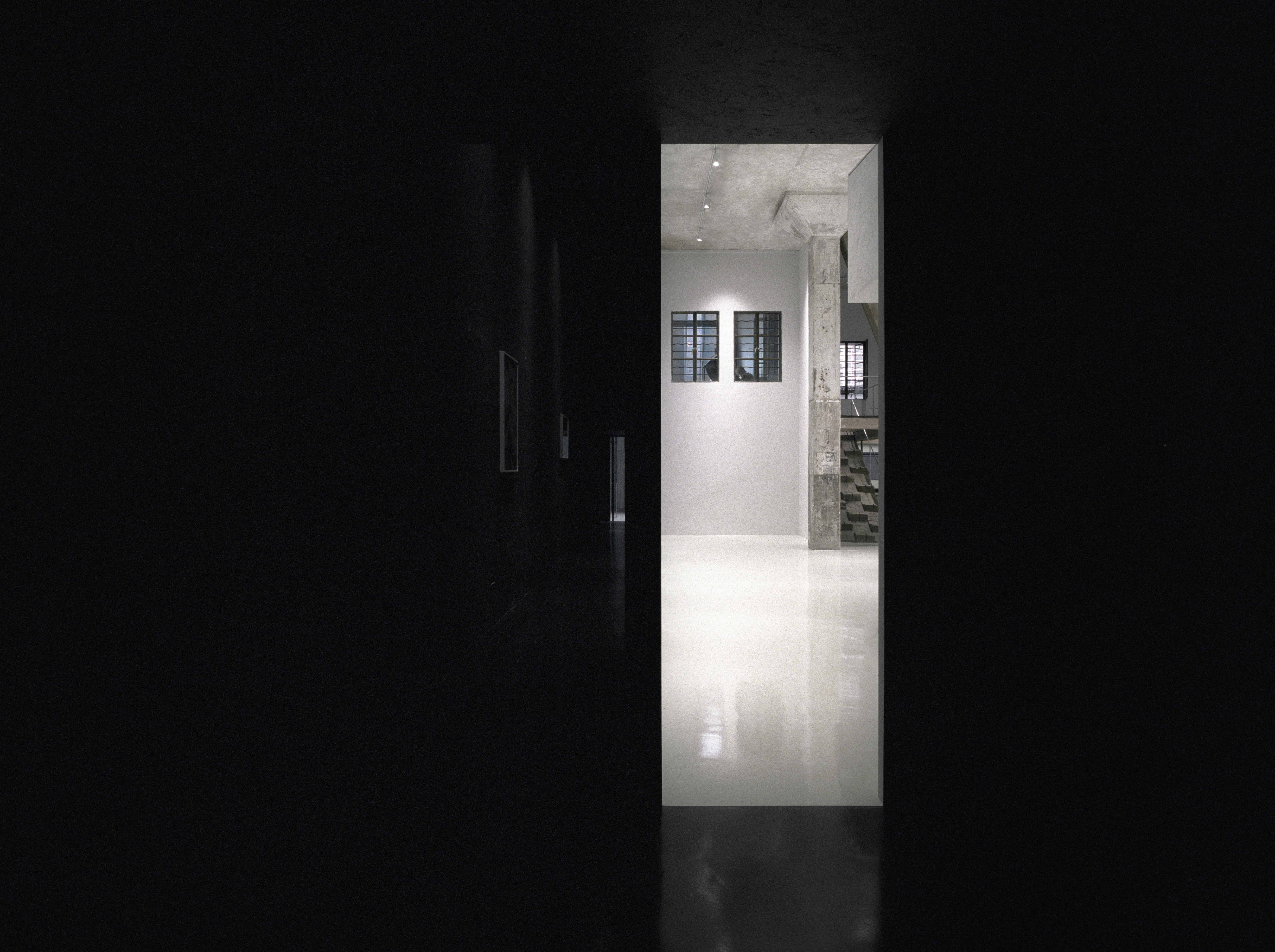
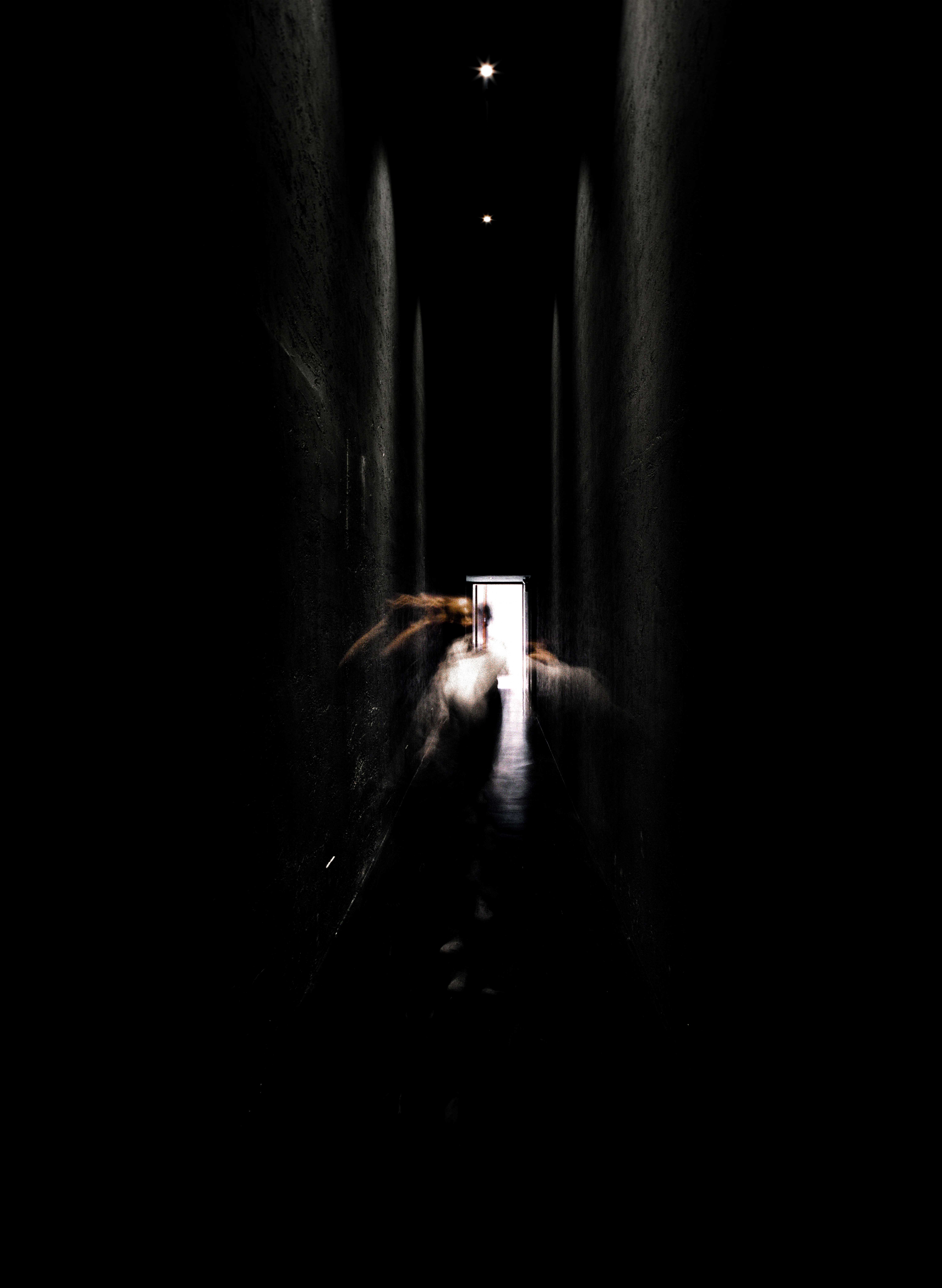
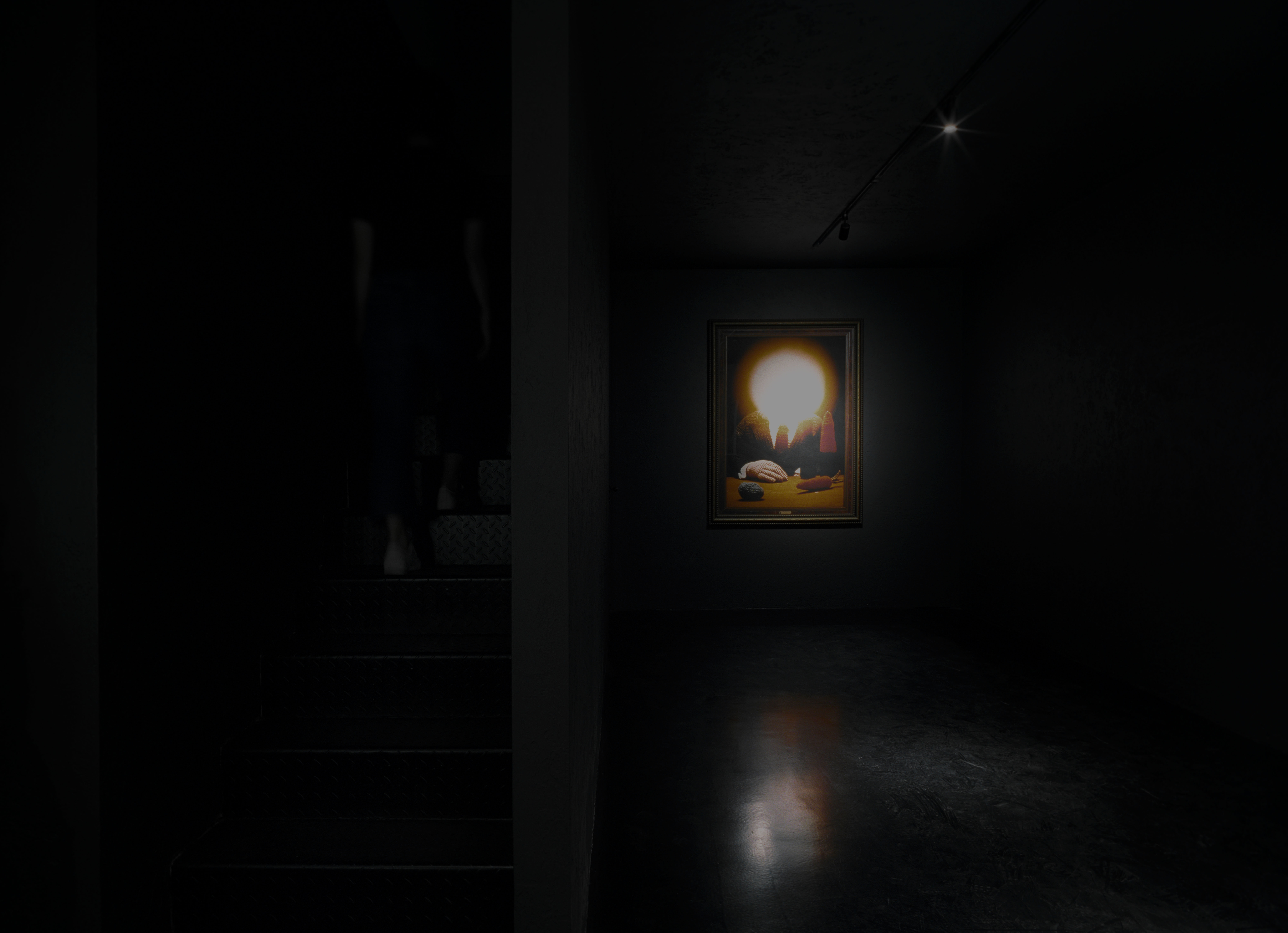
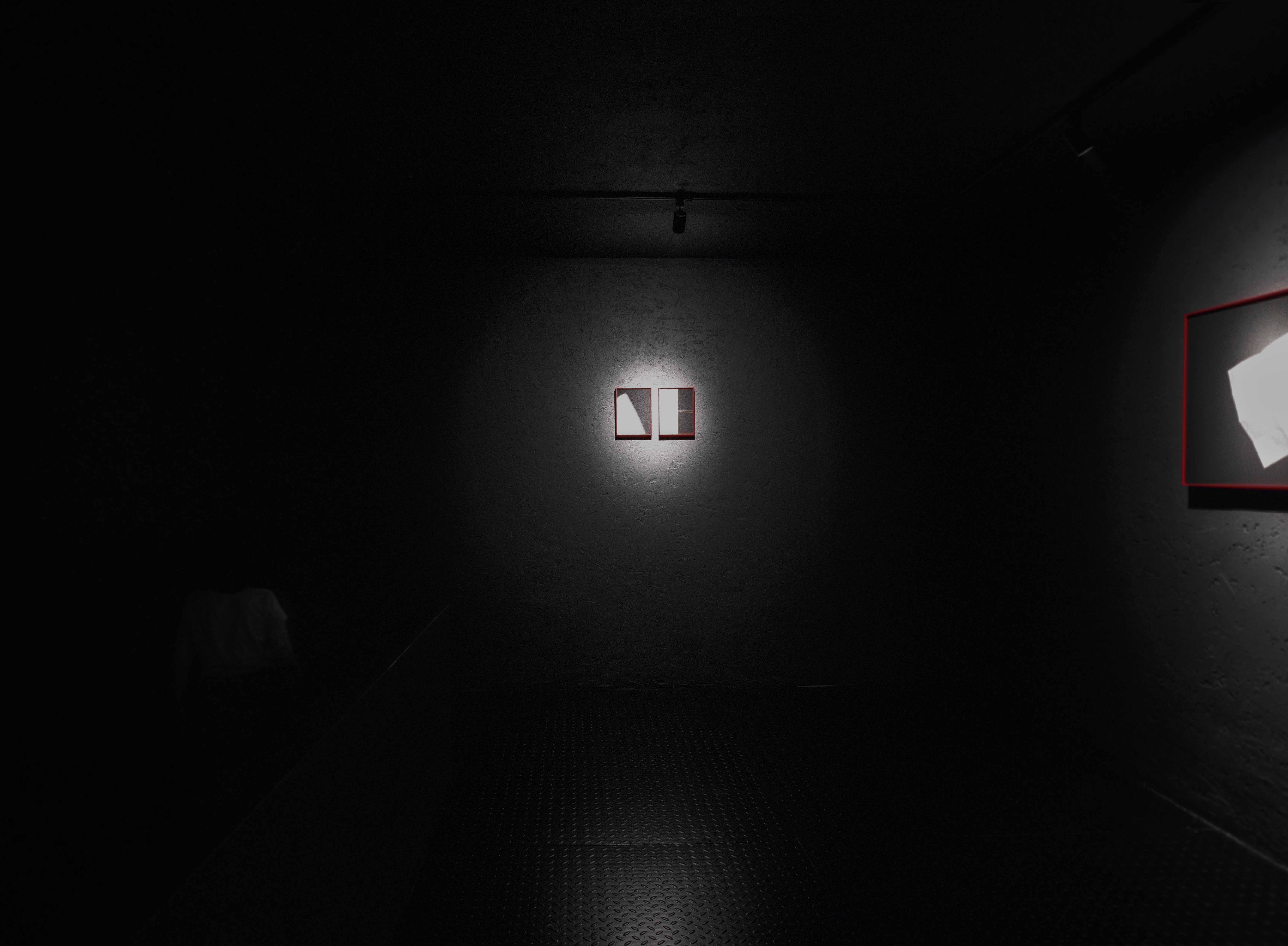
Apart from utilising the vertical space of the high ceiling, we also created new experiences by using the horizontal lines. The building has two entrances: one main grand door and a small side-door hidden at one corner of the gallery. Instead of continuing the open concept, we thought of directing people to go through layers of experiences and then go outdoor through the little hidden door. We erected a 6m full-height wall along the path to the side-door, to create a “Tunnel”, and grafted the steel staircase once sitting in the centre gallery to the wooden structured gallery to form a hidden path to the mezzanine level, transforming the wooden structured gallery to an independent hidden “Darkroom” gallery. In order to intensify the experience of going through the “Dark Room” and the “Tunnel”, we chose black as their main colour tone, and the walls also created with more texture to soften the sense of oppression.
A wall divided the light and the dark created dramatic effects. The experience is three-fold; as you walk from the “bright” centre gallery into the “darkness” of the Dark Room gallery, the path turns with a dark staircase to the end of the “Dark Room” on the mezzanine level, and you will find yourself overlooking the whole scene happening in the “Tunnel”. Groups of visitors either stopped by to admire the photography or just bought a cup of coffee and were heading out through the “Tunnel”. Now turn right and follow the light, you will find yourself on the “floating bridge” and staring at the café opposite.
The location of the existing wooden staircase for the café was originally located in the centre gallery, it broke the continual flow of the space, and blurred the boundary of the café, so we changed it. After confirming the durability and strength of the wooden structure and the wooden staircase with the contractor over and over again, we turned the wooden staircase 90 degrees anti-clockwise and placed in between two existing wood beams in the café. A side gallery is then formed naturally.
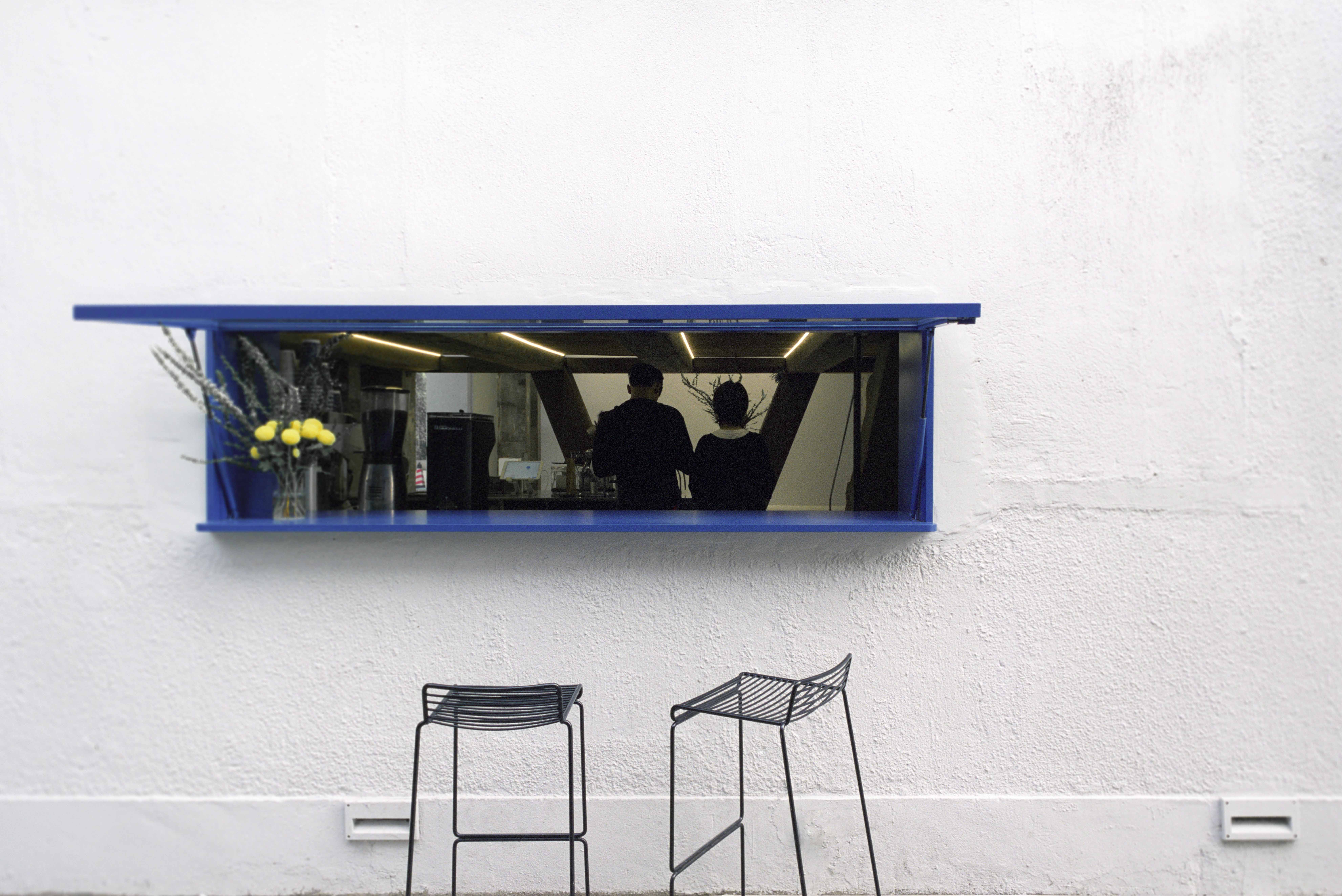
The circulation in the café is redesigned too. The beauty of the inverted A wooden structure was buried by the stainless steel café counter, creating cramping sightlines in its lounge that made it impossible for customers to sit for a long time. Therefore, we moved the whole working counter to the back, revealing the beautiful inverted A wooden structure, and at the same time creating more space for the customers to take a break. Walking up the wooden staircase to the mezzanine, one can see photographs hanging on the opposite side and the visitors walking along the “floating bridge”. Unintentionally, people have become part of the art gallery.
As you will realise, all these had turned the space into an immersive theatre. As soon as you step into this space, the story begins, and you will experience first-hand dreams coming alive. The whole building is a stage, the visitors are the performers, roaming about freely, and different stories are taking place simultaneously. When you wander around the bright or the dark, the open or the enclosed spaces, you are immersed in the stories of photographs and may share a smile with like-minded performers. As you wander off into the café to grab a latte, you may exchange a casual chatter with the barista. When you finally reach the end of your adventure, you will feel as if you just performed in a play, in which you are the protagonist and the audience. Our client curated an exhibition and directed a play during the Opening Party, to integrate people into the stories of this space, bringing the immersive theatre experience to its fullest.
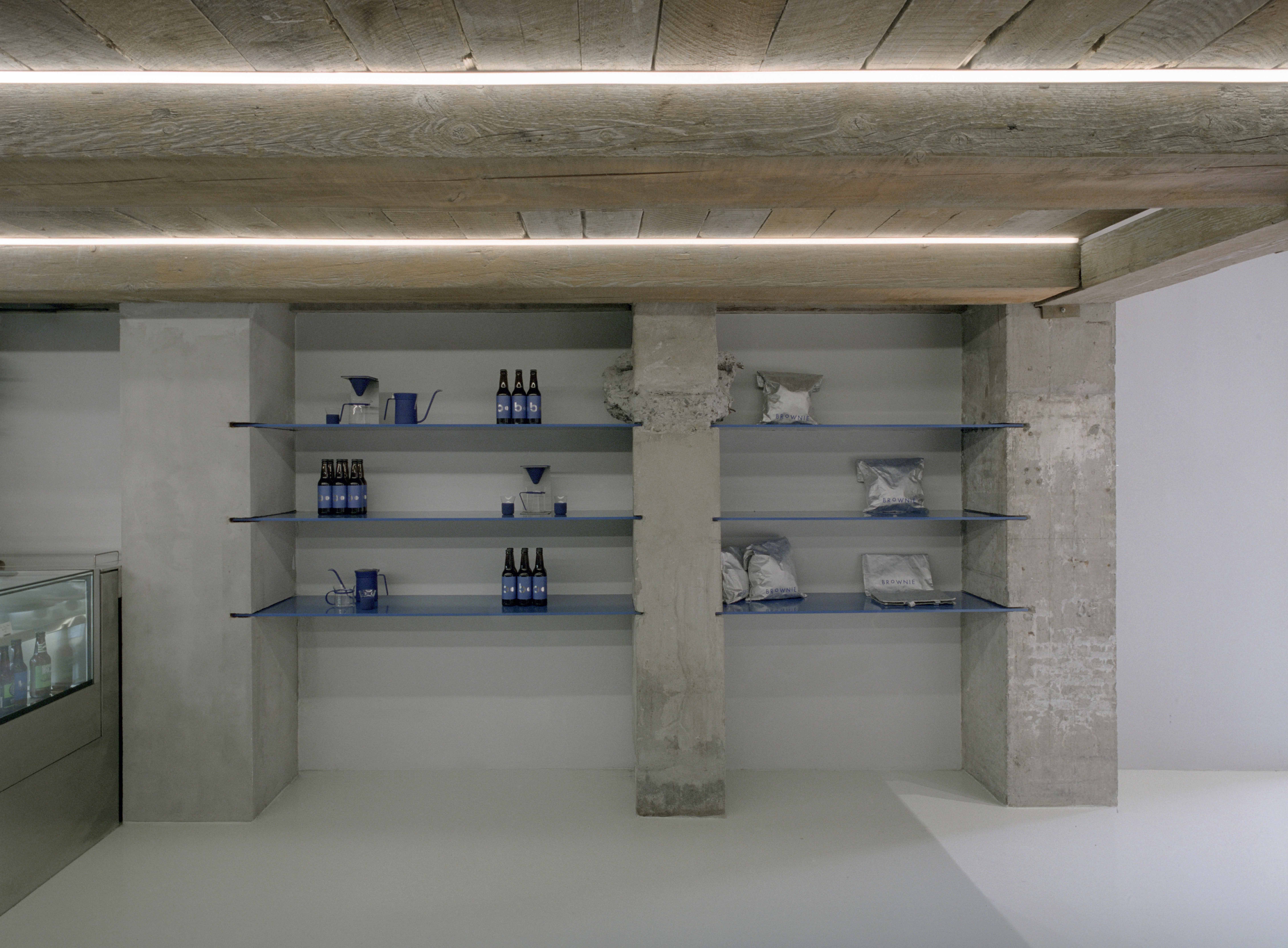
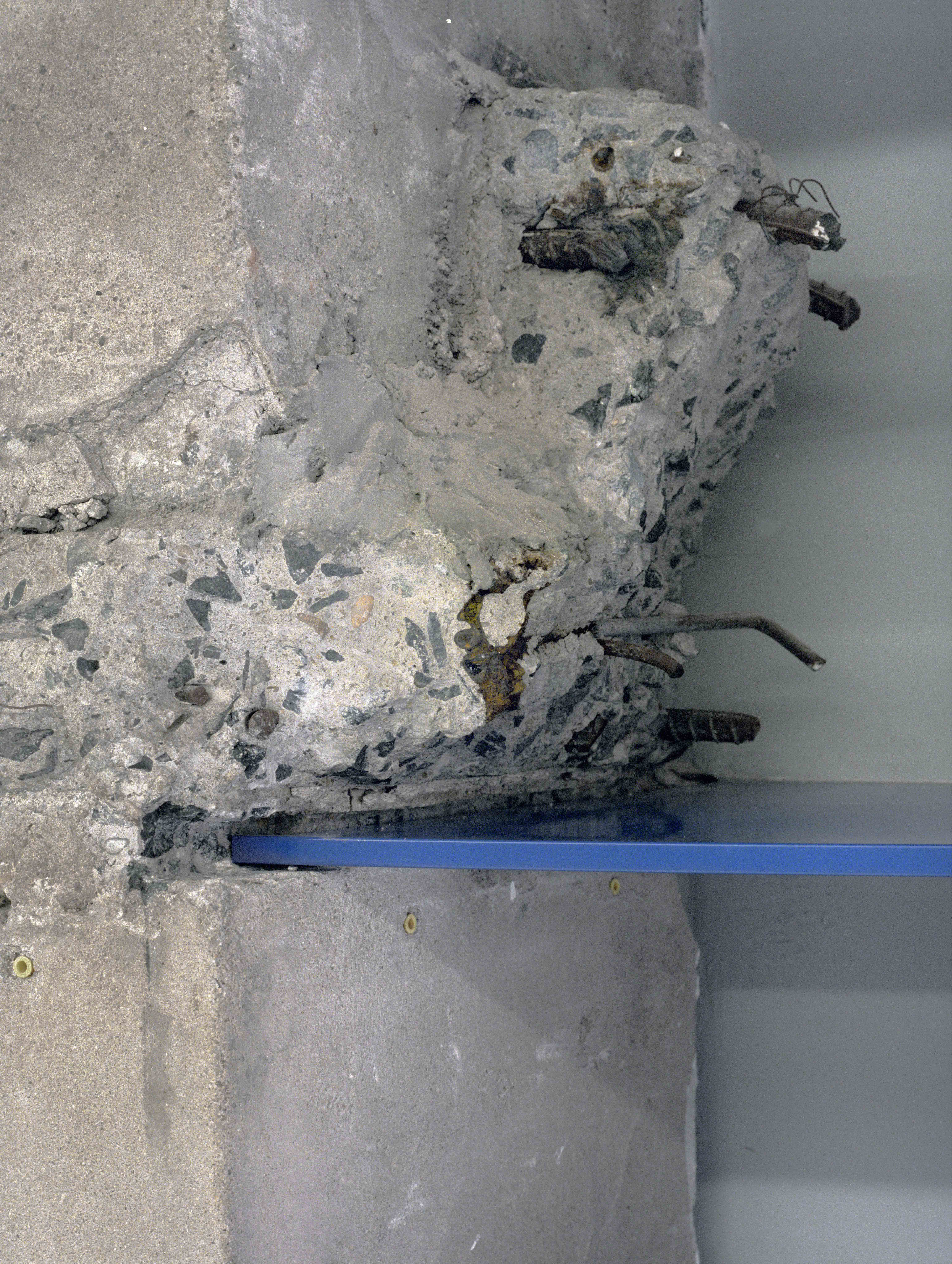
In terms of design detailing and selection of material, both rawness of the concrete columns and the exquisiteness of a contemporary art gallery has to be presented, and we gave much thought in accomplishing that. For instance, we cut a C-channel on the edge of these concrete columns and inserted very fine “BROWNIE blue” stainless steel plates to create display shelves. The texture of the external wall and the walls of the Dark Room is the result of experimenting again and again with contractors.
The furniture are also carefully selected to reflect the “imperfect” beauty of combining rawness and fineness. Chairs and benches are from the ‘Industreill’ series created by IKEA and Dutch designer Piet Hein Eek. At first glance, they seemed awkward and silly, but the handcrafted beauty sifts through them, creating harmony with the space. Complementing them is a set of tables from Hay’s NEU series. The combination of rough and exquisiteness of these furniture demonstrate perfectly the beauty of imperfection.
Since BROWNIE/Project is strongly tied with photography, we traced the history of photography and decided to use the very first method of photography – film, to capture and record the birth of this new space, and truthfully show its characteristics and delicate details. Just as what the young analog photographer Yoshiyuki Okuyama commented, he likes the warmth that remained on the film after pressing the shutter, because only the film photographs that are developed through time can best reflect how the viewers feel.
“What sort of architecture should we create? Is an architecture that does not rely on symbol or visual perception possible? It is in that pessimistic mood that I wrote the following series of essays. That is how a book with the extremely dispirited, inauspicious title, Architecture of Defeat, came to the written. ” Japanese architect Kengo Kuma mentioned in his book “Architecture of Defeat”.
As a medium for art, BROWNIE/Project is somewhat a defeated space similar to “Architecture of Defeat”. It is restrained, it is neither arrogant nor humble, and it is not over the top. It is a place for human, architecture, and environment to assimilate. An “Architecture of defeat” does not imply that it has lost in any way, but an architecture that has bowed to the balance of nature so to be the most appropriate place for all. This should be the pursuit for us as a young design studio.
